
Bridge to Ter-EBITDA and waterfall charts
Making effective bridge charts and waterfall charts in FP&A.

This is not about the 2007 live-action adaptation that left kids crying and traumatized (like myself). It is totally unrelated and happened a bit after I left Big 4 as an Audit Associate and was a few months into my industry role.
CFO asked: “Hey, I need you to bridge EBITDA from the budget to actuals for our month-end slide deck.”
I had no idea what a bridge was, no PY work paper, and was unaware of best practices for making one.
If you're like me and enjoyed Preliminary Analytical Reviews and variance analyses as an auditor, you might get a high from bridges.
What are bridge charts and waterfall charts?
In the context of FP&A, a “bridge” refers to a data visualization that details the positive and negative changes between two numbers. It tells the story of how an amount started to how it ended. In Microsoft Excel, it is referred to as a Waterfall Chart.
Typically, in my group, we use it for:
EBITDA - To visualize YoY changes from prior year to the current year’s EBITDA
Budget to Actual - To visualize actual vs. budget variances.
KPI changes - To visualize changes in unit sales by customer or costs by vendor
P&L breakdowns - To visualize breakdowns of FS lines to the bottom-line
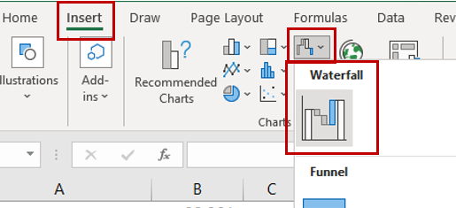
Create a bridge/waterfall chart in Microsoft Excel
Microsoft has a simple explanation of how to Create a waterfall chart.
If you follow those instructions, a first-timer might create a simple EBITDA actual-to-budget bridge that needs significant improvement like this:

This bridge lacks the following:
Story-telling: It is two-dimensional as it only reports line-item variances (Revenue, COGS, OPEX) and does not tell a story on how the company’s EBITDA has exceeded budget. Stop thinking like an accountant!
Formatting: It requires formatting improvements and is not yet finished.
Story-telling and formatting effective bridges & waterfalls
After making a couple of design and formatting changes, here is a revised bridge:

These revisions include the following:
Familiar KPIs: To tell a story, use familiar KPIs that executives measure and discuss. In this case, we used Gross Profit to explain the changes in Revenue & COGS and FTE for changes in Salaries & Wages expenses. Try not to use unfamiliar KPIs, or else you require an explanation of an explanation. A good visualization should explain itself without you in the room.
Titles & Number Formatting: A chart title and the appropriate “(in thousands)” tag was added. Additionally, the $ formats on the data labels were added.
Chart Colors: Totals are gray, increases are green, and decreases are red.
Decrease Gap Width: The gap width was decreased to 10% or less. This is to make the bars wider and more visually impactful instead of white space.

Wrap Text for Labels: Excel charts cannot wrap text, so you must add your line breaks (Alt + Enter keys) inside the cells of your labels.

As I wrote this, I realized I need to update the OPEX bridges for our 2023 budget…. that is the traumatic event that has me crying.